4 Simple Website Updates That Increase Giving
Savvy donors these days will have their first impression of you way before you meet them, and many donors move from a prospect to an online donor without ever even meeting you. There are a few key factors donor prospects use to decide on whether or not to donate to your charity. If you haven't updated your website recently, or even if you are in the process now, consider making these small optimizations to increase automatic donation revenue.
With each update or recommendation, we'll include a well-known charity's site so you can see the optimization in action.
1) State your mission right off the bat, front and center of your homepage. If a donor has to dig through your site to figure out what it is your charity does for the community or even the world, they are instantly hesitant to support you financially. If first impressions are everything, yours must be clear in the first 3 seconds of viewing the site. Take St. Jude's homepage for example. Even if you've never heard of them (and most of us have), you know instantly what they do.
2) Make your donate button easy to find on most or every page with ONE click to the credit card screen. If a donor is inspired to give, we want to remove every possible barrier that might discourage them or let them procrastinate. Donate buttons that are bright, stand out, fixed in the top right or lefthand corner, and take you immediately to the payment screen are the easiest way to capture donors quickly. Check out the button from the American Cancer Society page. It's impossible to miss, and even better, it directs you instantly to the donation form.
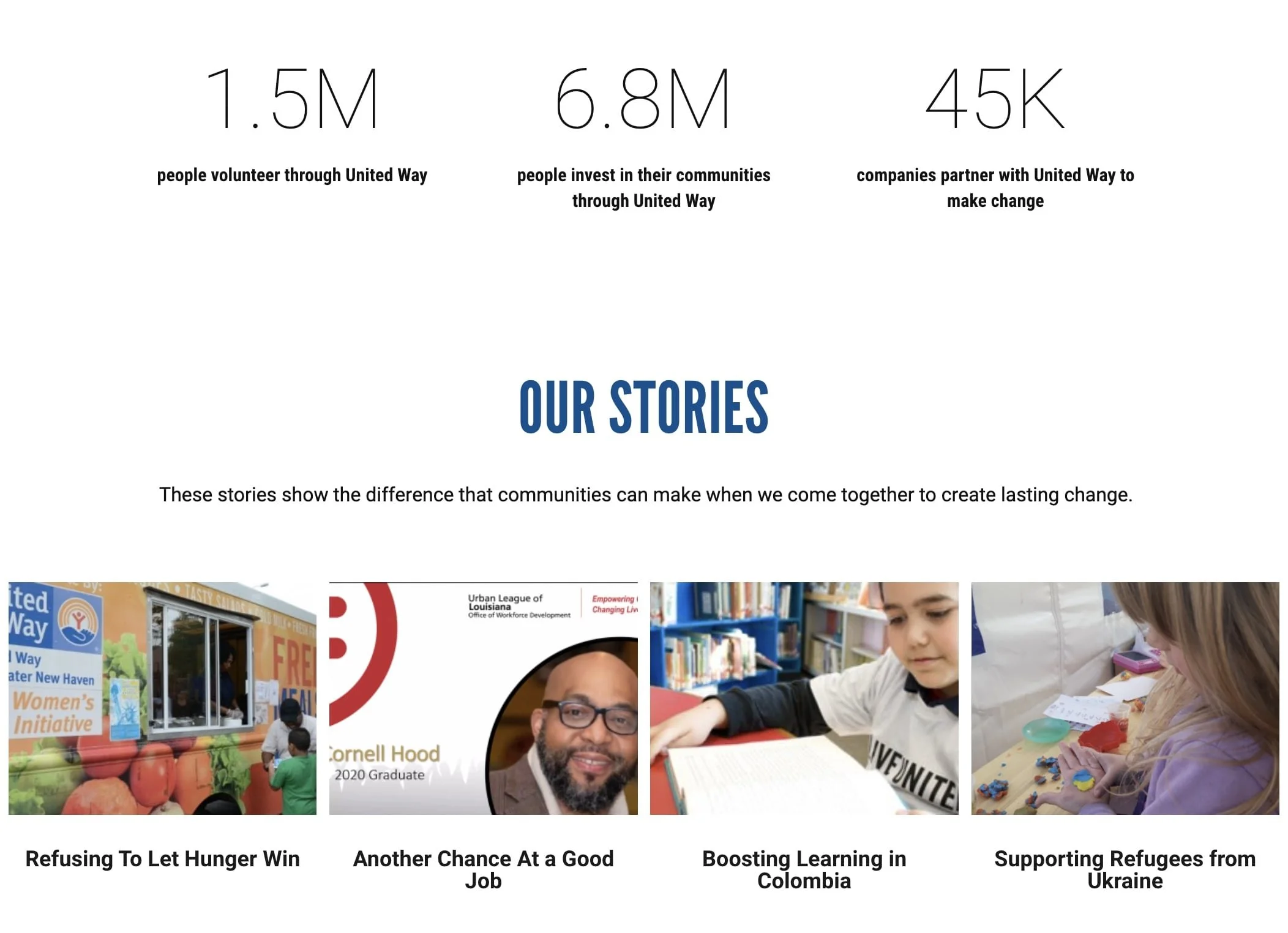
3) Prominently Share Impact Stories and Data. Potential donors want to know pretty quickly if they were to give, how that money would be spent. Impact data about how many people you've helped and how is great, but stories about those people is even better. We recommend having both on your site, and we recommend creating an easy pathway to get there from the home page. If I like what I see upon first impression, I would like to read more about how you help people and how my donation can help you. Impact stories cover that from top to bottom. Throw in a couple key stats, and your "about" section can look 10x more compelling. Take the United Way site for example. On their homepage, they have multiple ways to get to the impact stories page which is shown below with stats and links to stories of real people they've helped.
4) Calls to action at every turn and after every page. We never know which webpage or bit information may be the deciding factor in giving, volunteering, or reaching out, but the more we can guide our donor prospects to specific calls of action, the more likely we are to convert web traffic to donations and supporters. About page? List a giving option at the bottom. Events page? Ask for volunteers to help put together the event. Impact story? Link a donate button at the bottom so people can make a similar impact. Feeding America, one of the largest nonprofits in the country does this incredibly well. They have calls to action throughout each page with a variety of options, depending on what the web visitor is looking for.
There are of course, dozens of other small optimizations to improve your website's performance and donor conversion rates, but with those four, you get your charity 90% of the way, so if you only have limited bandwidth to make changes, start there and continue to improve in other areas as needed. With the right tools and techniques, your website can be working for your every day!
Want an even longer list of website updates and improvements to drive more revenue online? Reach out to us to schedule a free chat! We would love to learn about your mission and how we can maximize your fundraising revenue!


